After moving to Paris from London in 1961 Searle made a series of abstract expressionist works he titled 'Anatomies and Decapitations'. Of course it's impossible to speculate on the artist's state of mind but it was perhaps an effort to express the anguish over the situation he left behind -the decision to leave a faultered marriage with two children. The series could also have been a bid to achieve more respect from the art world as a 'serious' artist. It seems Searle wanted to be taken more seriously by the public and cultural arena after 15 years of commercial success in England. It's well known that Searle felt pigeon-holed at home and the 'Anatomies' could be seen as an attempt to re-invent himself.![]()
![]() The first real product of these investigations intended for a popular audience was Searle’s Cats (1967). Searle had previously worked with animals, illustrating Geoffrey Willans’s The Dog’s Ear Book (1958), but those had been cartoonish animals, akin to the trotting figures of the Molesworth books, shaggy human actors in human situations with human responses. Searle’s cats would be much more abstract in composition. As Searle’s humans become less figuratively real, so he uses his cats to represent human states without relying on reductive realism. . .
The first real product of these investigations intended for a popular audience was Searle’s Cats (1967). Searle had previously worked with animals, illustrating Geoffrey Willans’s The Dog’s Ear Book (1958), but those had been cartoonish animals, akin to the trotting figures of the Molesworth books, shaggy human actors in human situations with human responses. Searle’s cats would be much more abstract in composition. As Searle’s humans become less figuratively real, so he uses his cats to represent human states without relying on reductive realism. . . ![]()
Searle confirmed to me that the style of 'Munchausen' was directly informed by the experimental 'Anatomies'
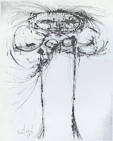
'In 1963, in New York's Bianchini Gallery, he launched a series of 73 ink, wash and watercolour 'Anatomies and Decapitations', anguished anatomical deconstructions never seen in Britain and still languishing in store.' The Guardian
'In 1962 he began work on his new satirical drawings, which were exhibited for the first time in the fall of 1963 in the Bianchini Gallery, New York. These ink-and-wash compositions, which are 291/8 X 20 1/2 inches in size and bear no titles, are the harvest of a long contemplative process: the mature commentary of an extremely sensitive observer upon human frailty in this day and age.'
Graphis magazine 109Some of Searle's American audience viewed the series as a parade of Rorshach ink-blot tests, more suitable for psychological than artistic analysis, and it is true that difficulties with women are suggested by the occasional violence of the treatment.' -Russell Davies''Anatomies and Decapitations, premiered at the Bianchini Gallery, NYC, in October 1963, were never exhibited in England or collected in book form. Over the previous couple of years, he had produced seventy-three of these large, disturbing explorations in ink, wash and watercolour, in which he was aiming to 'unmask' the human personality in a new way.' -Russell Davies![]()
'I know I am only on the fringe,' he wrote, when the exhibition was later transferred to Bremen, 'but for me it is the most exciting personal development in all the years I have spent exploring the medium of graphic art . . .It is the curse of the satirist that satire is basically a parasitical art-only thriving where there is weakness. The frailty of human character is the mushroom bed.' It seems a pity that these first fruits of his liberation from 'popular' fame did not meet a better fate' 'The accompanying reproductions are a token of the large pen and wash drawings that have been done in the past year. I saw them in Paris last October and was completely set alight by them. The artist regards them as a culminating point of the years of exploring in graphic work from which they developed 'quite naturally and normally' (sic)! He says: 'I had been seeking a way of "anatomizing" the character and behaviour of people in our own curious and suspended times; after a period of fumbling I feel I am beginning to state a little of what those feelings are.
'They are meant to be satirical and, in the best sense, rather uncompromising. As satire is basically a parasitical art- only thriving where there is weakness-the frailty of human character is my mushroom bed, or occasionally my mistletoe bough.' The artist's prose abounds in such visual imagery.'In some cases, the drawings could be described not so much as "anatomies" as "decapitations". Size has a good deal to do with the strength of these drawings. Their slightly monumental scale enables them to speak a little louder than some of my other work. But whatever they say - I still like people!'
G.S. Whittet 'The Studio' magazine
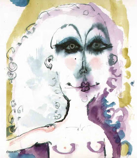
A much softer, colour feminine anatomy appeared in 'Carnet de Croquis' published in 1992